In the saturated digital ecosystem, capturing user attention and providing immediate context is a constant challenge. Headlines are the primary tool in this battle, but they sometimes need a strategic ally to be truly effective. This is where a subtle yet powerful typographic component comes into play: the “eyebrow heading.” The eyebrow is a descriptive word or phrase placed just above the main headline, designed to add context, categorize content, and improve the user’s ability to scan information quickly. This article provides a deep guide to its strategic function, copywriting, visual design, technical implementation, and its direct impact on user experience (UX) and accessibility (A11y).
Strategic Fundamentals of the “Eyebrow”
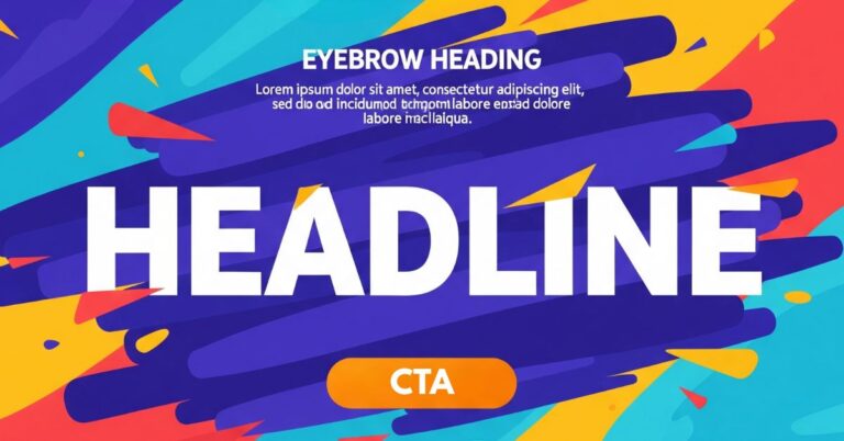
What Exactly Is an “Eyebrow”?
Formally, an “eyebrow heading” is a short phrase or keyword placed above a headline to provide additional context. This element, inherited from print journalism, is also known by other names such as “Kicker,” “Overline,” or “Running Section Head”2. It is crucial not to confuse the eyebrow heading, which is a typographic element, with eyebrow navigation, which refers to a secondary navigation bar at the top of a page with utility links like “Log In” or “Help”.
The Key Purpose: Context and Categorization
The “eyebrow” is not an ornament; its primary function is to introduce a topic or categorize the content. It acts as a visible label indicating whether an article belongs to a specific category (e.g., “Technology,” “Opinion”) or a series.
Its deepest value lies in its ability to free the headline from the burden of being purely descriptive. The eyebrow takes responsibility for clarity and context, allowing the main headline to be more creative, emotional, or intriguing. For example, an ambiguous headline like “The Silent Echo That Sells Millions” becomes instantly clear with an eyebrow that reads “CONTENT STRATEGY”. This synergy effectively balances functional clarity with creative engagement.
Its Place in the Typographic Hierarchy
Despite its higher physical position, the “eyebrow” occupies a secondary or tertiary place in the information hierarchy. Its visual design must be subordinated to the headline to avoid competing for attention. Although it is read first from top to bottom, it is often cognitively processed after the main headline. The user’s eye is first drawn to the largest and highest-contrast element (the headline), and then seeks context in the eyebrow. For this reason, an “eyebrow” should never contain information critical to understanding the headline.
Content Strategy: How to Write Effective “Eyebrows”
Ideal Use Cases (What to DO)
- Categorization and Grouping: This is its most common use. It works as a clear label to group content by topic or section. Examples: “MARKET ANALYSIS,” “BEGINNER’S GUIDE”.
- Series Identification: Ideal for indicating that an article is part of a sequence. For example: “PART 3 OF 4”.
- Context for Creative Headlines: It allows you to ground ambiguous or clever headlines, providing the clarity the headline sacrifices for the sake of engagement.
- Interactive Functionality: It can function as a clickable link that directs to an archive page with all content from that category, turning it into a navigation tool.
Content Antipatterns (What NOT to do)
- DO NOT include critical information: Users often skip the “eyebrow” in their initial scan. If the headline is incomprehensible without it, the structure is flawed.
- DO NOT use it for brand names: Its purpose is to categorize content, not for brand promotion.
- DO NOT use it as a headline itself: It is a supporting element, not a substitute for a well-structured main headline.
- DO NOT start a “half-sentence”: The eyebrow and the headline should be independent units of information and make sense on their own.
- DO NOT be inconsistent or repetitive: It should be based on a coherent taxonomy. Using it for random information adds visual noise.
- DO NOT use it if the headline is already clear: It becomes redundant if the headline is already short and descriptive.
Visual Design and Technical Implementation
Design Principles: Deliberate Subordination
To ensure the “eyebrow” supports without competing, designers should adjust its typographic properties:
- Size: Significantly smaller than the headline, often between 12-14px.
- Weight: A medium or semibold weight ensures legibility without overpowering the headline, which is usually heavier.
- Text Transform: Using text-transform: uppercase is a very effective convention to mark it as a label or metadata.
- Letter Spacing: A slight increase (e.g., 0.05em) improves the readability of short, uppercase text.
- Color: Using a lower-contrast color (like a soft gray) or a secondary accent color differentiates it from the headline.
HTML Implementation: Semantics and Accessibility (A11y)
The biggest technical challenge is resolving the tension between visual and semantic hierarchy.
Antipattern to Avoid: The Broken Heading Hierarchy
It is a critical error to mark up the “eyebrow” with a lower-level heading tag than the headline that follows it (e.g., an <h4> above an <h2>). This breaks the logical structure of the document, confusing screen readers and search engines.
Recommended HTML Structures
| HTML Structure | Semantics | Accessibility (A11y) | SEO Impact | Recommendation |
| <h4 class=”eyebrow”>…</h4> <h2>…</h2> | Incorrect | Poor. Creates an illogical outline. | Negative | Not Recommended (Antipattern) |
| <div class=”eyebrow”>…</div> <h1>…</h1> | Neutral | Good. The DOM order is correct. | Neutral | Recommended (Pragmatic) |
| <p class=”eyebrow”>…</p> <h1>…</h1> | Good. Describes the eyebrow as introductory text. | Good. Correct order and clear <h1>. | Positive | Recommended (Semantic) |
| <h1 class=”eyebrow”>…</h1> <p>…</p> (Perkins Style) | Excellent (if the eyebrow is the real title). | Excellent. The <h1> is correctly identified. | Very Positive | Best Practice (A11y-Focused) |
In this last approach, the <h1> is styled to look like an eyebrow, while a <p> is styled as the main headline, inverting the visual hierarchy to respect semantics.
Impact on User Experience (UX)
User Behavior and Usability
- Often ignored in the initial scan: User testing confirms that eyes are first drawn to the larger headline. This reinforces the rule of not placing critical information in the eyebrow.
- Reduces cognitive load: For users actively scanning for keywords, the eyebrow is very valuable. It presents the category immediately, helping them assess the content’s relevance more efficiently, especially with long or creative headlines.
- Facilitates A/B testing: The “eyebrow” should not be the variable to test, but rather the constant context that allows for bolder A/B tests on headlines. By setting the context (e.g., “CASE STUDY”), different headlines can be tested without losing clarity.
What should we keep?
The “eyebrow heading” is a micro-design component that, while simple, demands careful strategic, content, and technical consideration. Its primary function is for context and categorization, never to convey critical information. Its design must be visually subordinate to the main headline, and its technical implementation must prioritize HTML semantics and accessibility over visual convenience. By avoiding common antipatterns like a broken heading hierarchy or poorly written content, teams can use the eyebrow to refine information architecture, improve usability, and create clearer, more effective digital interfaces.