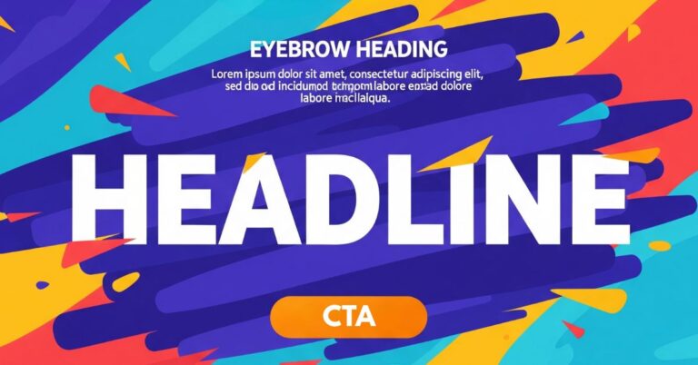
The hero section of a website is the digital “moment of truth.” It’s your first, and most critical, chance to win or lose a conversion in mere seconds. With over half of mobile users bouncing if a site takes more than three seconds to load, the urgency is real. In this high-stakes environment, every element must work in perfect harmony to grab attention, communicate value, and guide the user forward. At the very heart of this is the Call to Action (CTA). Far from being just a button, the CTA is the climax of your hero section’s story—the bridge that turns a passive visitor into an active participant and drives business goals. This guide will provide a comprehensive framework for auditing, redesigning, and optimizing your hero section CTAs with confidence, ensuring they’re built not just to impress, but to convert.
The Strategic Foundation: Aligning Your Hero with Conversion Goals
Before you write a single line of code, an effective hero section begins with a solid strategy. Its power comes from a carefully built context that aligns your brand’s promise with the user’s needs.
The Unique Value Proposition (UVP) as Your North Star
The first rule is absolute clarity. Your hero section must immediately answer the user’s fundamental question: “What’s in it for me?” This is where your Unique Value Proposition (UVP) comes in. It should be a single, compelling idea.
A great example is Notion. Their headline, “Build something beautiful,” doesn’t list features; it focuses on the user’s aspirational benefit of creating something aesthetic and functional. By focusing on one central idea, you reduce the visitor’s cognitive load. Every element, especially the CTA, must be the logical conclusion of this UVP to avoid confusing the user.
The Persuasion Triangle: Connecting with the User’s Mind
For a user to click, they must feel the offer is relevant and credible. This is achieved by connecting on three fundamental levels:
- Aspiration (Focus on Desired Outcomes): The best copy doesn’t describe what a product is, but what the user can become with it. Instead of “Track your expenses,” try “Take control of your money and grow your savings.” You’re not selling a tool; you’re selling a better future.
- Empathy (Address Pain Points): Speaking directly to a user’s frustrations creates an instant connection. A payroll platform using the headline, “Stop wasting hours on spreadsheets every payday,” is far more powerful than a generic feature list. It shows you understand their reality.
- Trust (Build Credibility): Trust is a prerequisite for action. Back up your promise with social proof like client logos, short testimonials, or security badges placed strategically near the CTA. These elements act as subtle reassurances that dissipate doubt at the critical moment of decision.
Crafting Irresistible CTAs: The Power of Persuasive Copy
The few words on your CTA button are some of the most important copy on your entire site. Every word must be chosen with precision.
Start with Action Verbs
The foundation of an effective CTA is language that drives action. Always start with a strong, imperative verb.
- Use: “Get,” “Start,” “Discover,” “Join,” “Download.”
- Avoid: Vague phrases like “More information.” A stronger alternative is “Discover our plans.”
Focus on Value, Not Just Action
A common mistake is writing CTAs that describe what the user does (“Submit”) instead of what they get. Frame the click around its value.
- Instead of “Download,” use
“Download your free guide.” - Instead of “Subscribe,” use
“Subscribe for exclusive offers.”
The security company
Aura does this perfectly with “Get protection now,” embedding the core benefit directly into the button text.
Create Urgency and Exclusivity
Leverage the “Fear Of Missing Out” (FOMO) to encourage immediate action. Phrases like “Limited time offer” or “Reserve your spot now” give users a compelling reason to act now rather than later.
Important: This urgency must be real. Faking scarcity will destroy user trust.
Embrace Clarity, Brevity, and Personalization
- Be Brief: Aim for five words or fewer.
- Be Clear: The user must know exactly what will happen after they click. Avoid ambiguous terms like “Submit,” which can cause anxiety. “Get your quote” is much better.
- Be Personal: A simple switch from “Start your free trial” to “Start my free trial” can make a huge impact. One study showed this change increased clicks by 90% by giving users a sense of ownership over the action.
Design That Converts: Visuals and Implementation for Your CTA
Persuasive copy is only half the battle. If your CTA isn’t visually prominent and technically flawless, its message will be lost.
Visual Hierarchy and Visibility
Your CTA must be seen to be clicked.
- Contrast and Color: The most critical factor for visibility is contrast. The button color must “pop” against the background. Think of Netflix’s bright red CTA on a dark background—it’s an undeniable focal point. Colors also carry psychological weight:
| Color | Psychological Connotations | Recommended Use Cases |
| Red | Urgency, Passion, Excitement | E-commerce, Entertainment |
| Green | Security, Growth, Permission | Finance, Health, SaaS |
| Blue | Trust, Professionalism, Stability | Technology, B2B, Social Media |
| Orange | Enthusiasm, Creativity, Fun | Subscriptions, Creative Brands |
| Black | Luxury, Sophistication, Power | High-end Brands, Fashion, Tech |
- Size and Whitespace: The button should be large enough to be easily noticed and tapped on mobile, but not so large that it looks aggressive. Surrounding the CTA with generous whitespace (negative space) is a powerful technique to isolate it from other elements and draw the user’s eye directly to it.
Strategic Placement and Mobile Experience
- Location: The golden rule is to place the primary CTA “above the fold”—the area visible without scrolling. Most users won’t scroll to the bottom of the page, so placing your only CTA there is a critical error.
- Mobile-First: With most traffic coming from mobile, this is a requirement. Buttons must be large enough to be tapped easily by a thumb, and text must be perfectly legible on small screens.
Technical Performance is Part of the Design
A slow-loading hero section is an instant conversion killer. The first three seconds are crucial. Slow performance creates a poor first impression and erodes trust before the user even sees your CTA. Key technical optimizations include:
- Image Compression: Use modern formats like WebP to reduce file size.
- Lazy Loading: Defer loading of below-the-fold images until the user scrolls to them.
- Video Optimization: If using a background video, ensure it’s lightweight and hosted on a reliable CDN.
One Goal, One Click: Managing Multiple CTAs
A common strategic question is how many CTAs to include. The research is overwhelmingly clear: for maximum impact, focus on one primary CTA. Presenting too many choices leads to “paralysis by analysis,” where the overwhelmed user simply chooses nothing. In some cases, multiple competing CTAs have been shown to reduce conversions by as much as 266%.
Figma is a master of this, with a single, clear CTA: “Get started for free.” This reduces friction and channels all user attention toward one desired path.
However, there is a place for a secondary CTA.
- Primary CTA: The main action you want the user to take (e.g., “Start free trial”). It should be visually dominant.
- Secondary CTA: A lower-commitment alternative for users not yet ready to convert (e.g., “Watch demo”). This CTA must be visually subordinate—designed as a plain text link or a “ghost button” (outline only)—so it doesn’t compete with the primary one.
From Guesswork to Growth: Data-Driven CTA Optimization
The launch of your CTA isn’t the end; it’s the beginning. True optimization comes from a continuous process of measuring, testing, and refining based on real user data, not intuition.
The cornerstone of this process is A/B testing. This involves creating two versions of your CTA (e.g., with different text or colors), showing each to a segment of your audience, and measuring which one performs better.
Key variables to test (one at a time):
- CTA Text: “Get your guide” vs. “Improve your skills.”
- Color & Design: A high-contrast red vs. a trusting blue.
- Placement: Above the headline vs. below the sub-headline.
To measure success, track your Click-Through Rate (CTR) and your post-click Conversion Rate using tools like Google Analytics for quantitative data and Hotjar for qualitative insights like heatmaps.
What should we keep?
The Call to Action is where attention becomes action. A high-performing CTA is not an accident; it’s the result of a deliberate process that blends strategy, psychology, copywriting, and design. The path to excellence is built on three pillars: strategic clarity (having one clear goal), focused persuasion (using copy and design to motivate), and iterative optimization (constantly testing and learning from your users). By moving from guesswork to a data-driven approach, you can turn your hero section into a reliable engine for conversion and growth.